
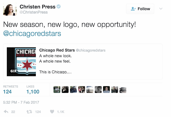
Midday on Tuesday, the Chicago Red Stars unveiled a brand new, sleeker look for the 2017 season in the likes of a re-branding of their long-time traditional crest. While emulating the old logo by drawing inspiration from the Chicago city flag, with the flag’s red stars representing major historical events from the city’s history (the great Chicago fire, the 1893 World’s Fair, etc), the new crest sharpens the more hand-drawn look of the original shield while still retaining its recognizable light blue and scarlet construct, not wholly dissimilar to the more minimalistic rebranding of the U.S. Soccer Crest last year.
New season, new slogan
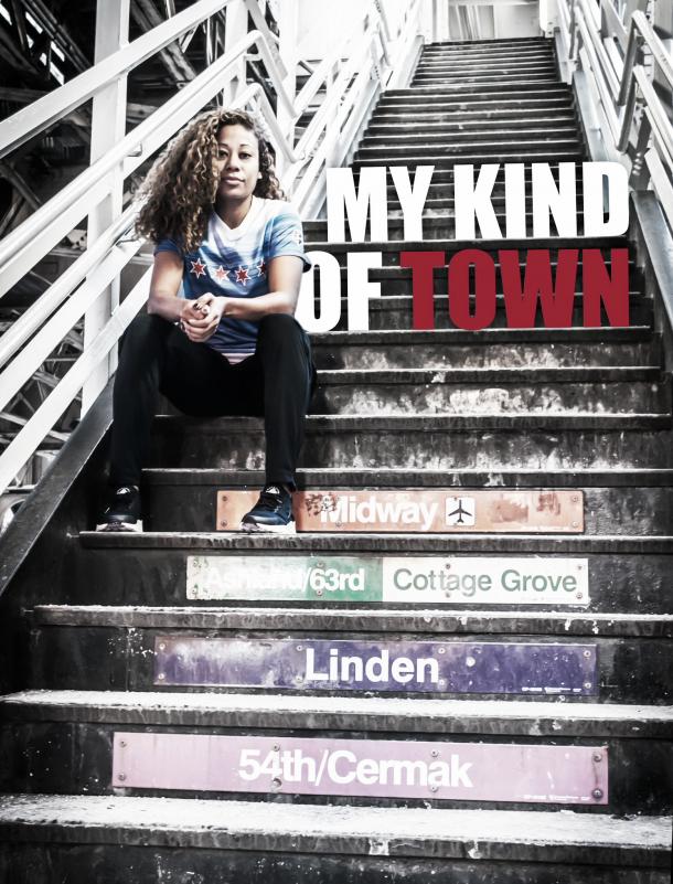
In addition to the new-look logo, the Red Stars released a new hashtag/slogan, ‘My Kind of Town’, drawn from the Frank Sinatra song of the same name, extolling the values of the Windy City. As Red Stars owner Arnim Whisler said in the team’s official release, “When the Red Stars first brought women’s professional soccer to Chicago in 2007, we knew it would be an uphill battle, but something that was worth it for the city. Today, we continue to grow and have the best players in the world playing right here in Chicago. This branding kicks off a new era for our franchise as we aim to create a more city based look to honor everything that Chicago represents.”
Adding to the national footprint by going local
To kick off the new campaign, the Red Stars released a series of photos featuring CRS defender and recent US Women’s National Team addition Casey Short, a native of Naperville IL, a Chicago-land suburb. The entire re-branding seems to reflect the re-affirmation of the Red Stars’ commitment to its upcoming season, the NWSL, and the city the team represents. The new look drew praise from current and former Red Star players alike and demonstrates not only a more comprehensive look from a long-time league stalwart but also the next level for a very competitive team looking to create a new local footprint during the NWSL’s historic 5th season.